Go back

Big Church Festival
Big Church Festival
Big Church Festival
Big Church Festival
Big Church Festival
Ticketing journey reskin
Ticketing journey reskin
Ticketing journey reskin
Ticketing journey reskin
Ticketing journey reskin


Introduction
Introduction
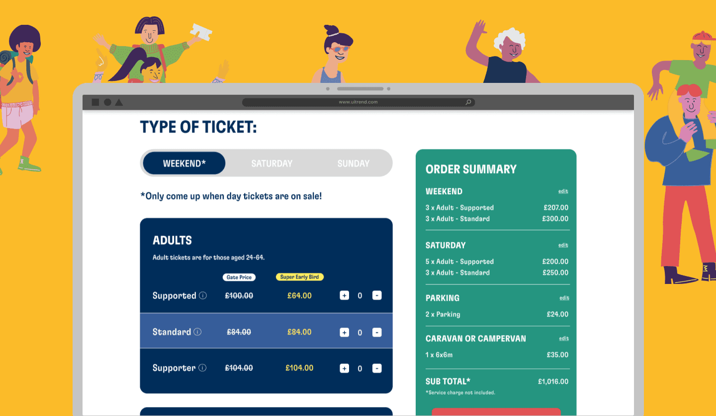
This is a project I worked on for the client Big Church Festival. The client wants to optimise their website's ticketing journey to purchase festival tickets., the
This is a project I worked on for the client Big Church Festival. The client wants to optimise their website's ticketing journey to purchase festival tickets., the
PROJECT TYPE
PROJECT TYPE
Client Project
Client Project
TIMELINE
TIMELINE
Nov - Dec 2022
Nov - Dec 2022
TOOL
TOOL
Figma & Clickup
Figma & Clickup
TEAM
TEAM
User researcher
UX designer (My role)
Developer
User researcher
UX designer (My role)
Developer
OVERVIEW
OVERVIEW
I worked as a UX Designer with the User Researcher to improve the website's user experience. We focused on addressing critical issues and improving the ticketing process after conducting preliminary research on usage and engagement.
I worked as a UX Designer with the User Researcher to improve the website's user experience. We focused on addressing critical issues and improving the ticketing process after conducting preliminary research on usage and engagement.
CHALLENGE
CHALLENGE
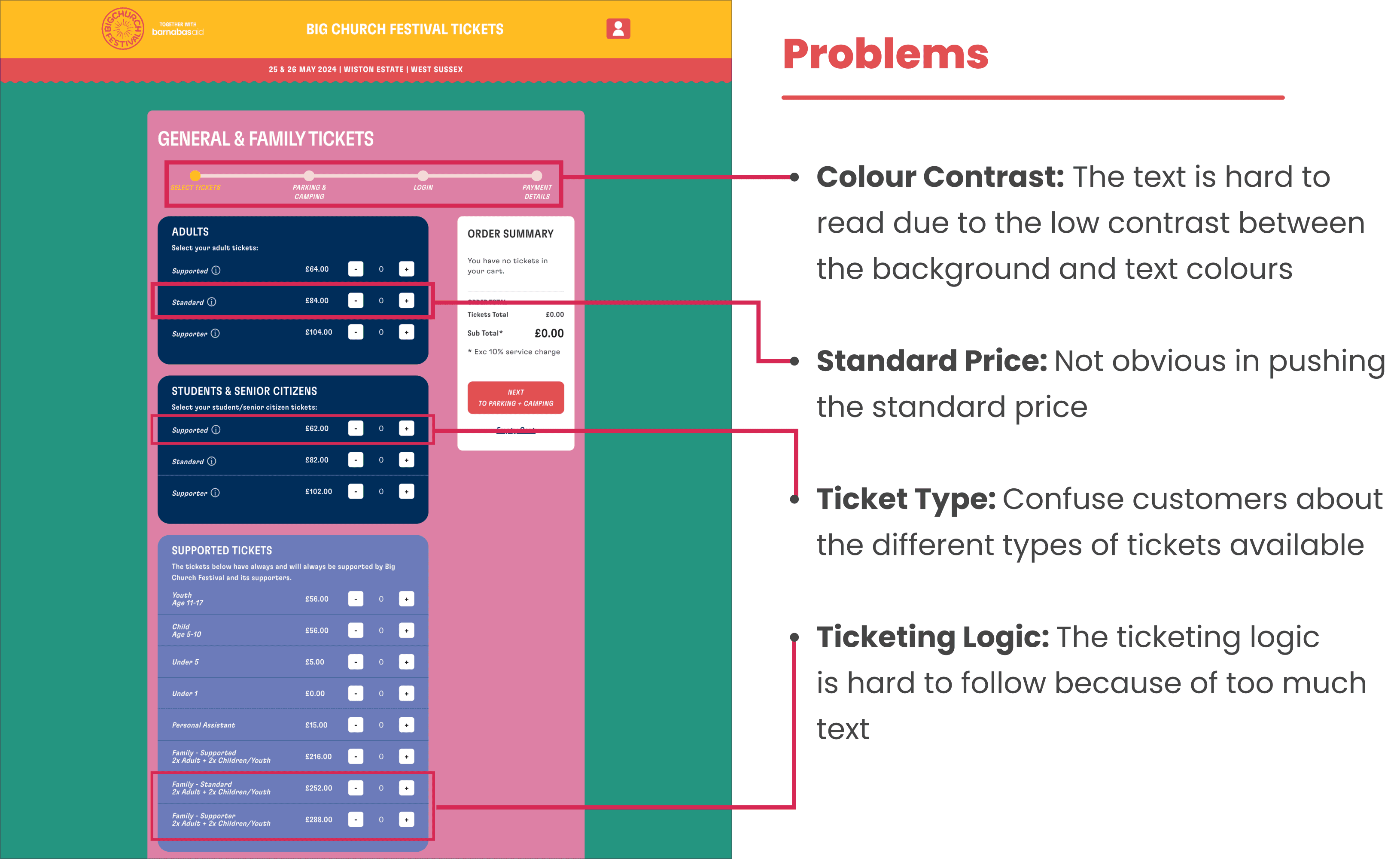
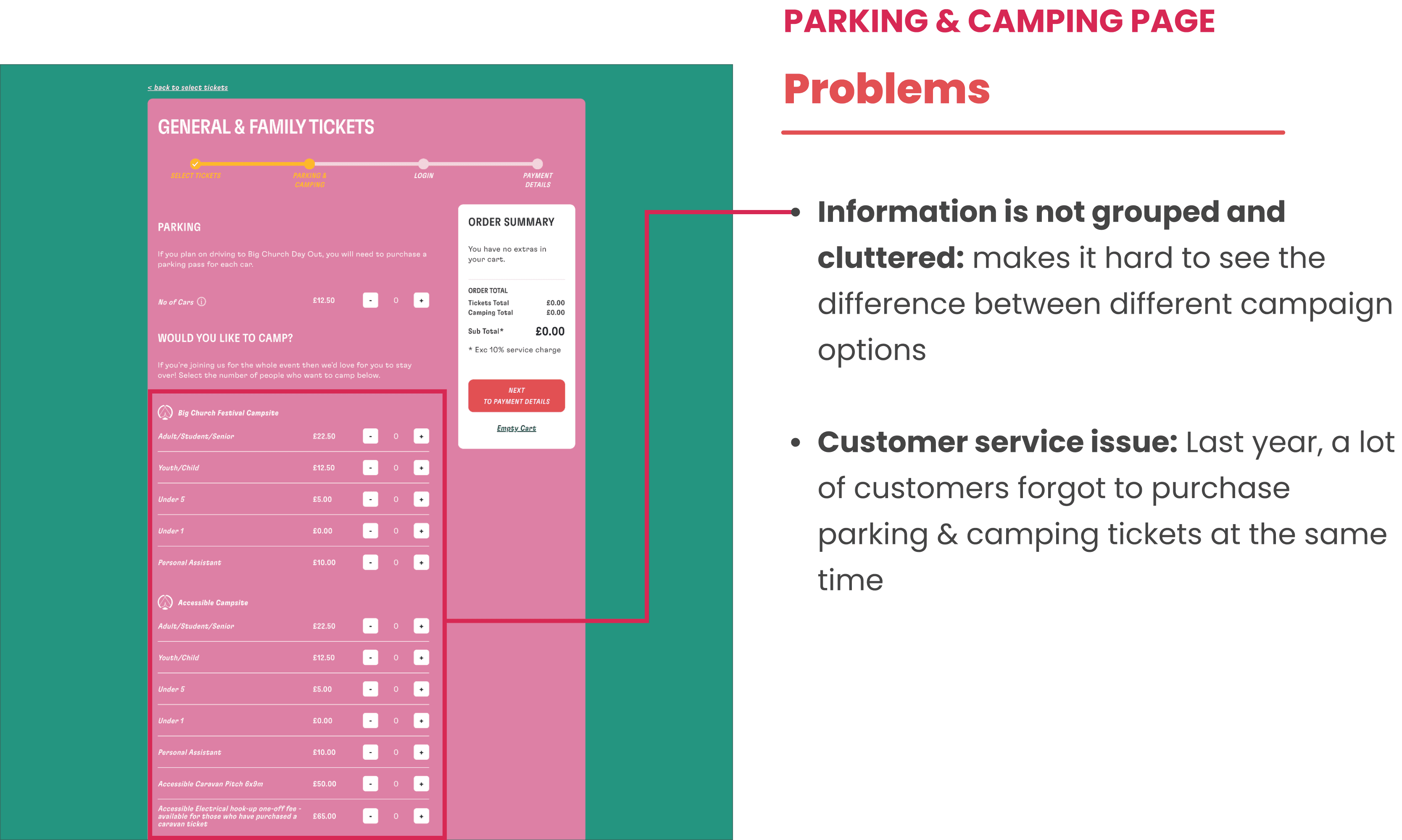
The client wants to improve the ticketing experience and address issues reported by the CS team:
The customer forgot to purchase a camping ticket for the camping option
Lead customers in buying a general ticket
A new camping option has been added this year
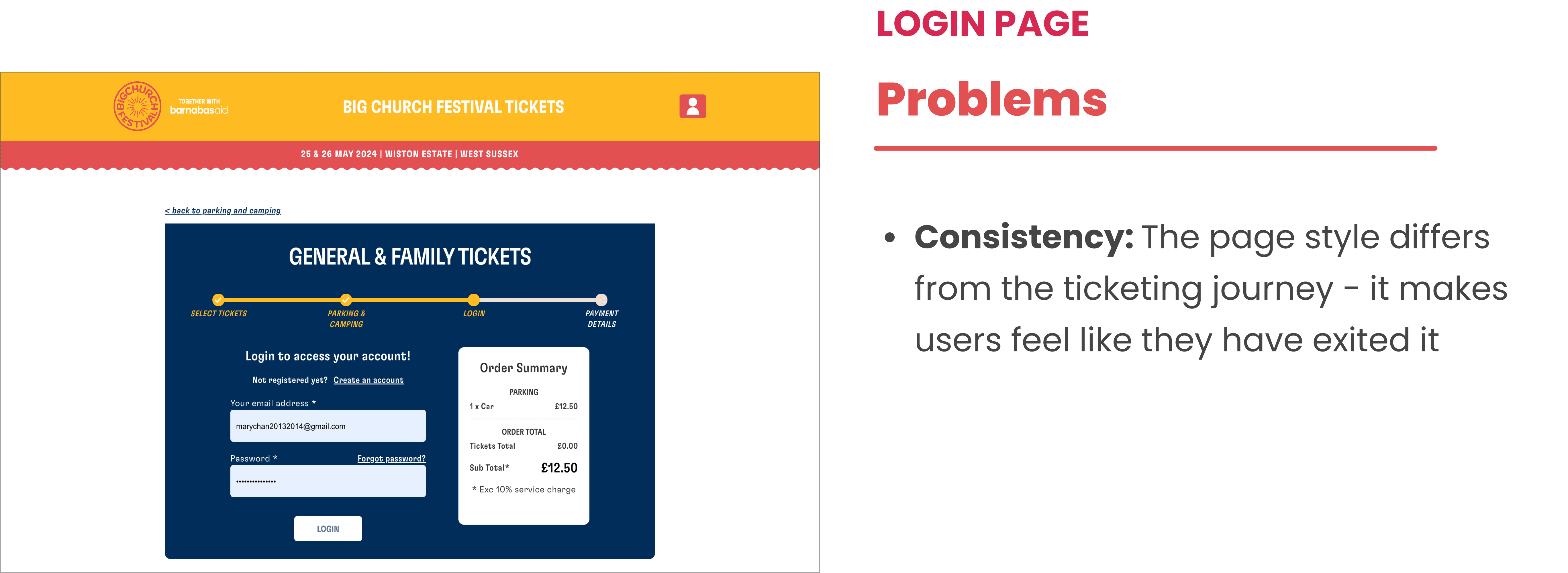
Improve existing usability issues
The client wants to improve the ticketing experience and address issues reported by the CS team:
The customer forgot to purchase a camping ticket for the camping option
Lead customers in buying a general ticket
A new camping option has been added this year
Improve existing usability issues
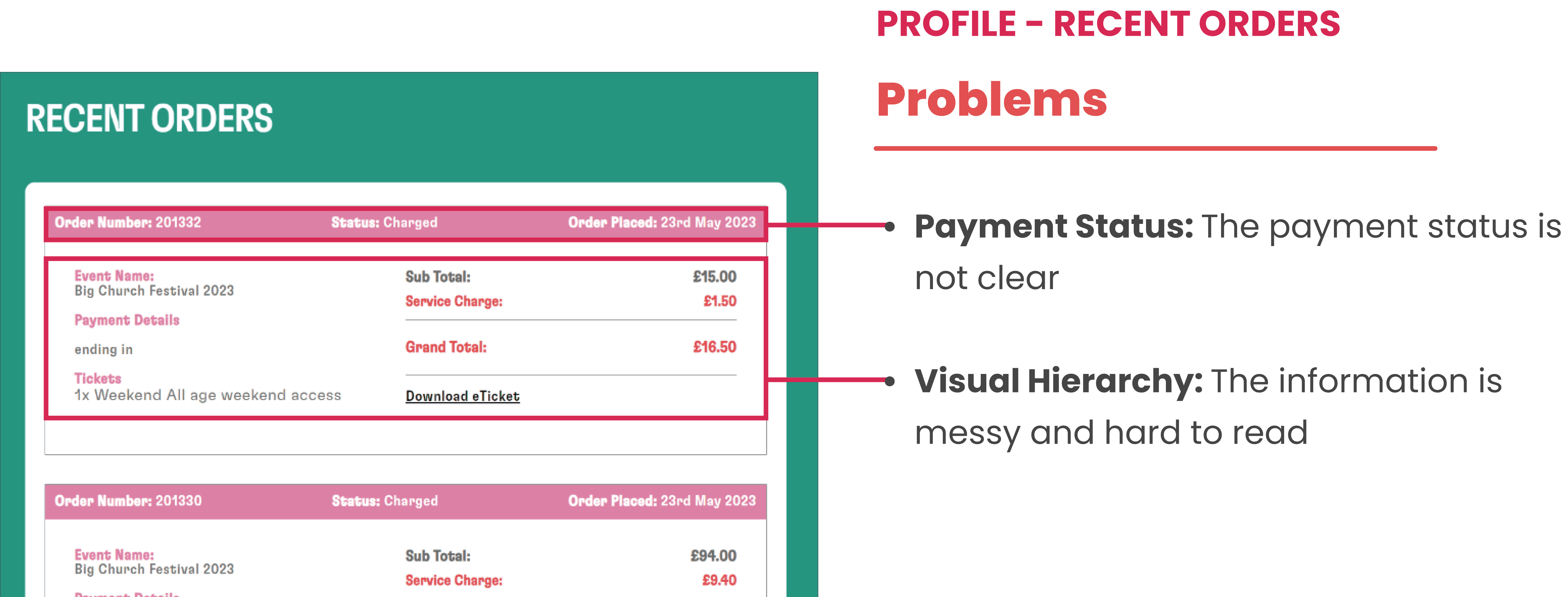
Problem
Problem

Design
Design
Tackling each problem to design the final prototype
Tackling each problem to design the final prototype
Due to time constraints, we will skip wireframing and jump straight to creating a hi-fi prototype for the website reskinning project, here is the final product:
Due to time constraints, we will skip wireframing and jump straight to creating a hi-fi prototype for the website reskinning project, here is the final product:
PROBLEM 1: ACCESSIBILITY ISSUES BETWEEN BACKGROUND AND TEXT COLOUR
PROBLEM 1: ACCESSIBILITY ISSUES BETWEEN BACKGROUND AND TEXT COLOUR
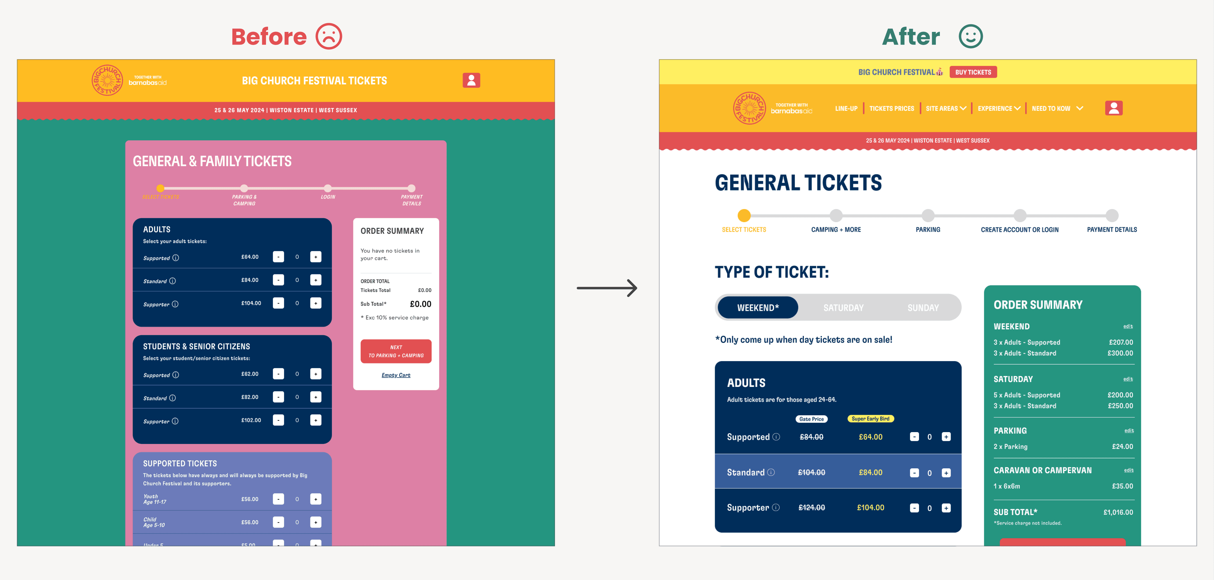
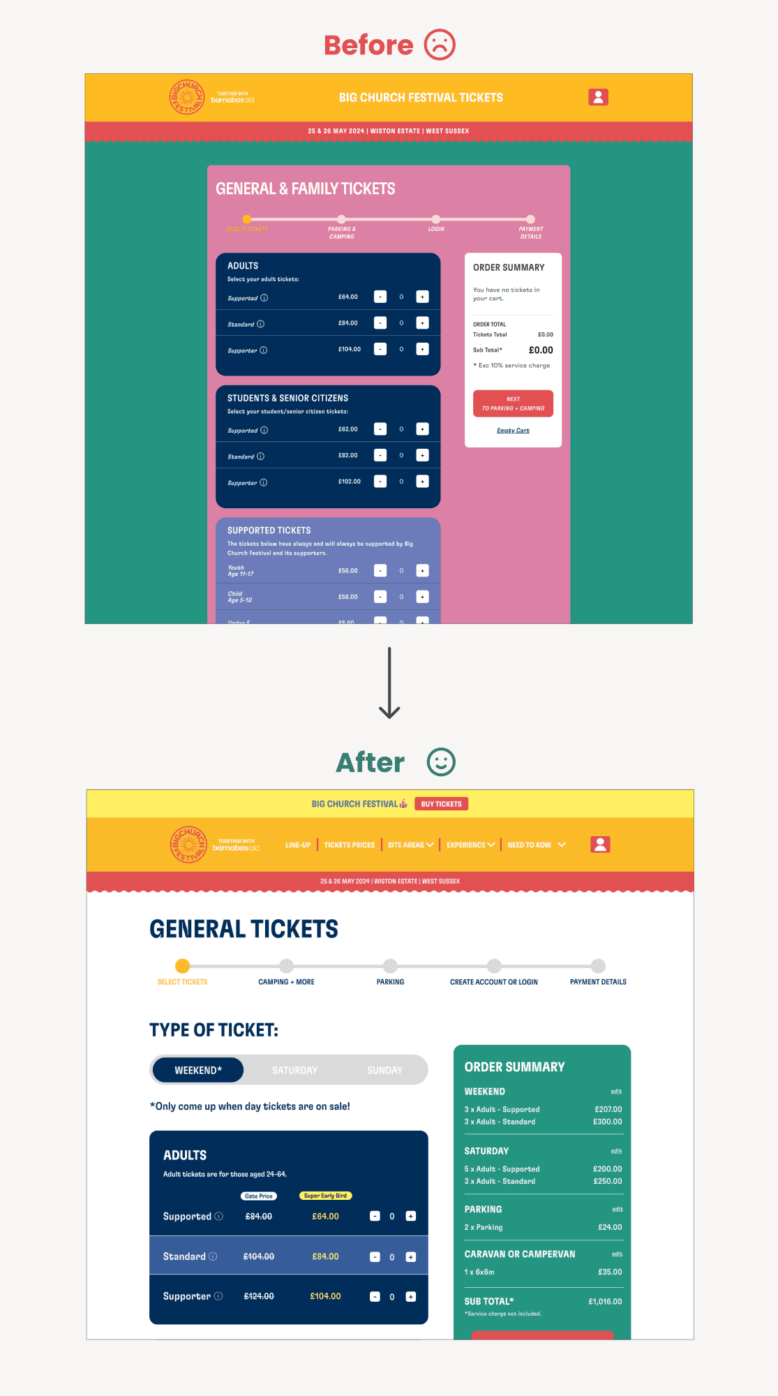
Simplifying the overall colour scheme to create a contrast between background and text
Simplifying the overall colour scheme to create a contrast between background and text
Change the background colour to white for better readability while keeping the brand's colour scheme intact.
Change the background colour to white for better readability while keeping the brand's colour scheme intact.
PROBLEM 2: CUSTOMERS ARE MISTAKING PARKING TICKETS FOR CAMPING TICKETS
PROBLEM 2: CUSTOMERS ARE MISTAKING PARKING TICKETS FOR CAMPING TICKETS
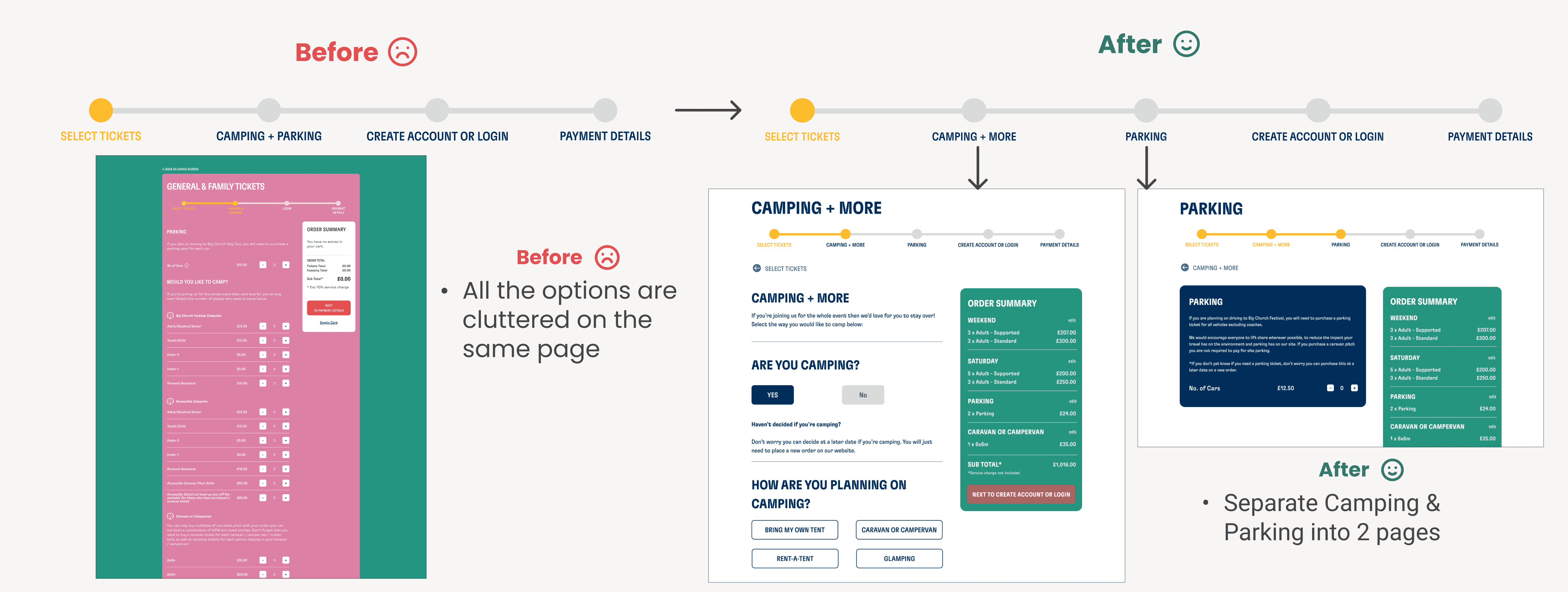
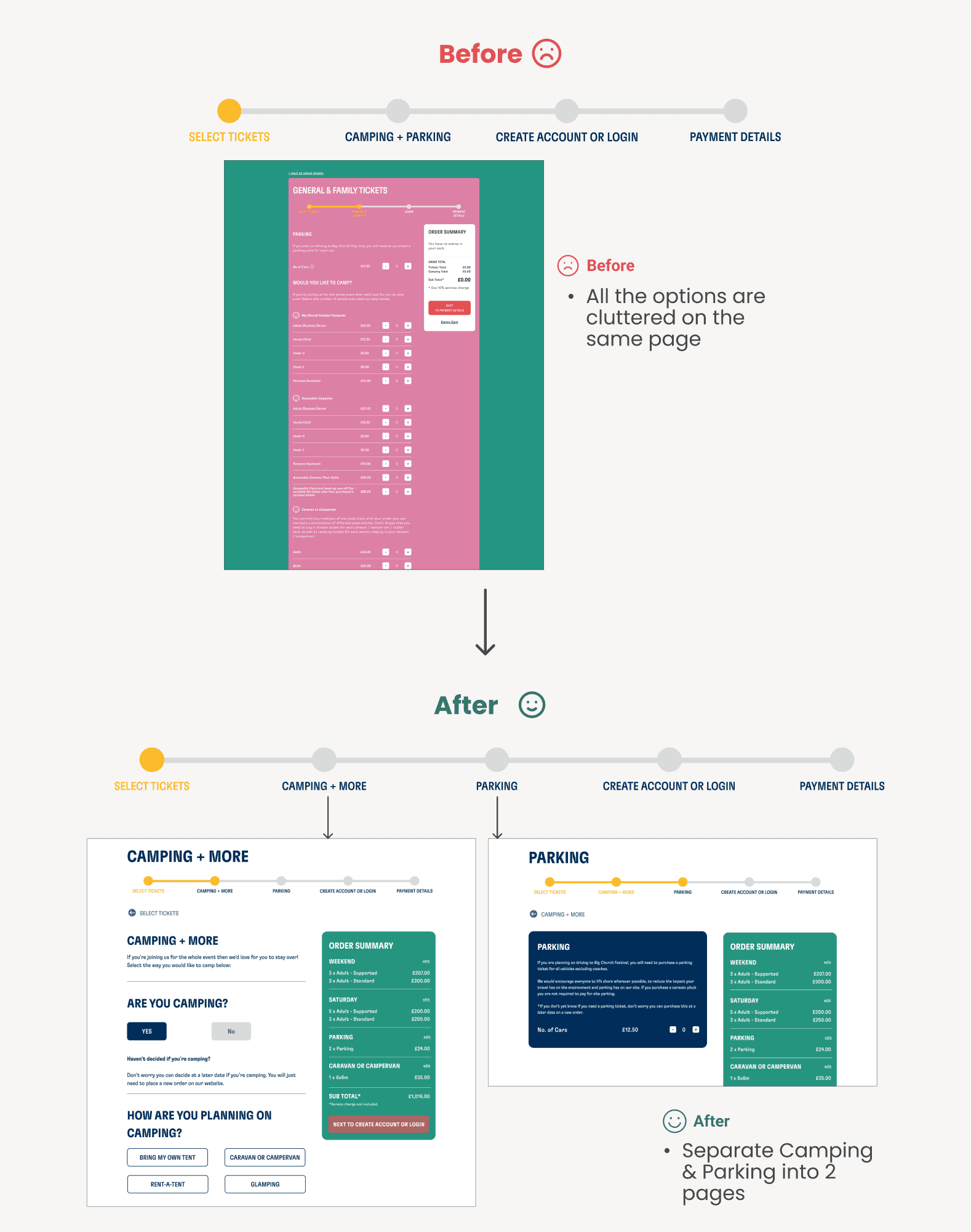
Rearranging the ticketing sequence - separate camping & parking ticket
Rearranging the ticketing sequence - separate camping & parking ticket
Camping customers can easily purchase everything in the camping section first. And for people who are driving, they won't forget to buy a parking ticket.
Camping customers can easily purchase everything in the camping section first. And for people who are driving, they won't forget to buy a parking ticket.

PROBLEM 3: NOT LISTING ORDER DETAILS IN THE ORDER SUMMARY BOX
PROBLEM 3: NOT LISTING ORDER DETAILS IN THE ORDER SUMMARY BOX
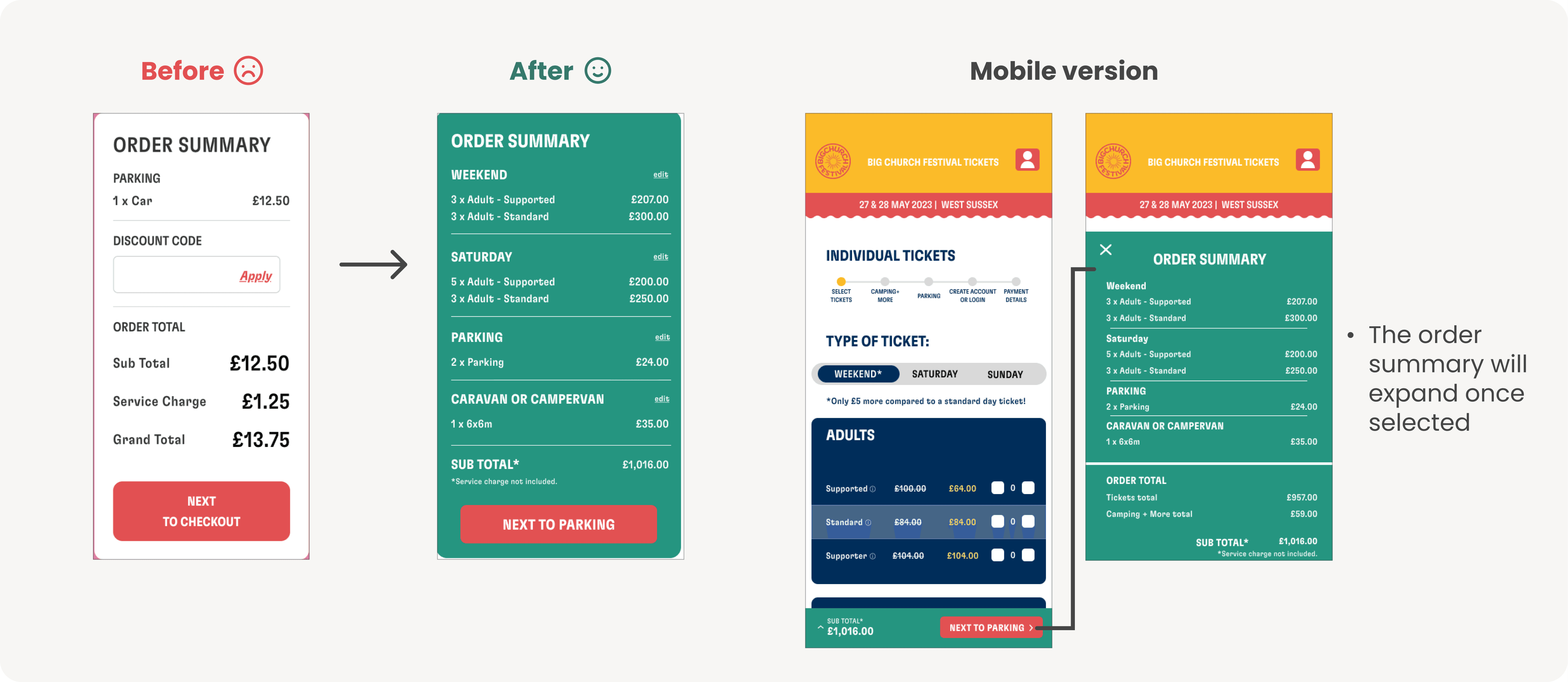
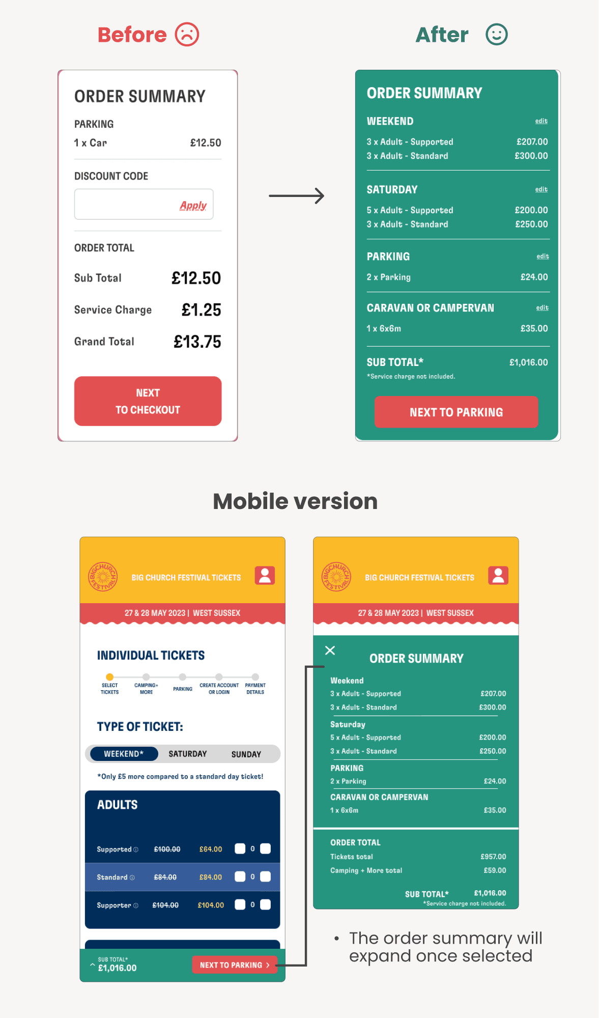
Adding each item to the order summary & improving the mobile version
Adding each item to the order summary & improving the mobile version
We categorized the order by product type and redesigned the mobile version to match the website.
We categorized the order by product type and redesigned the mobile version to match the website.

PROBLEM 4: MESSY LAYOUT ON THE RECENT ORDER PAGE
PROBLEM 4: MESSY LAYOUT ON THE RECENT ORDER PAGE
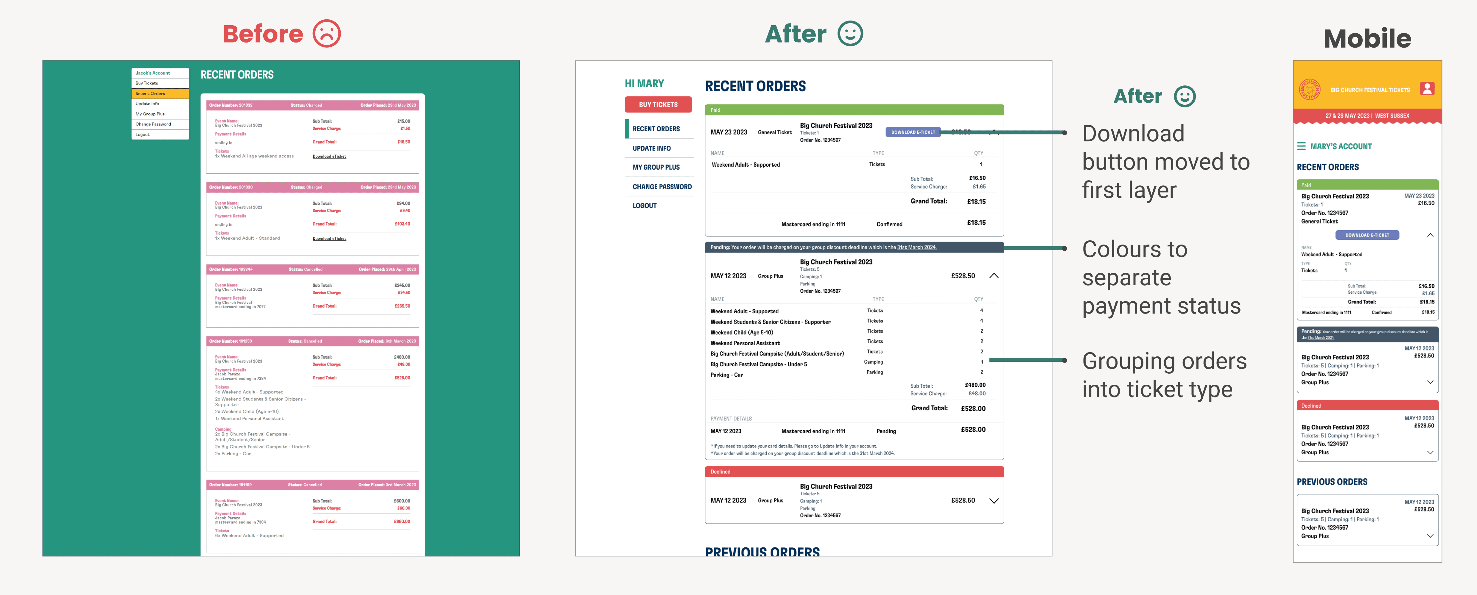
Improving clarity by changing color and grouping information into sections
Improving clarity by changing color and grouping information into sections
We've made some improvements. Payment status bar has new colors for different stages, download ticket is now at the top layer for better experience, and mobile version is redesigned.
We've made some improvements. Payment status bar has new colors for different stages, download ticket is now at the top layer for better experience, and mobile version is redesigned.
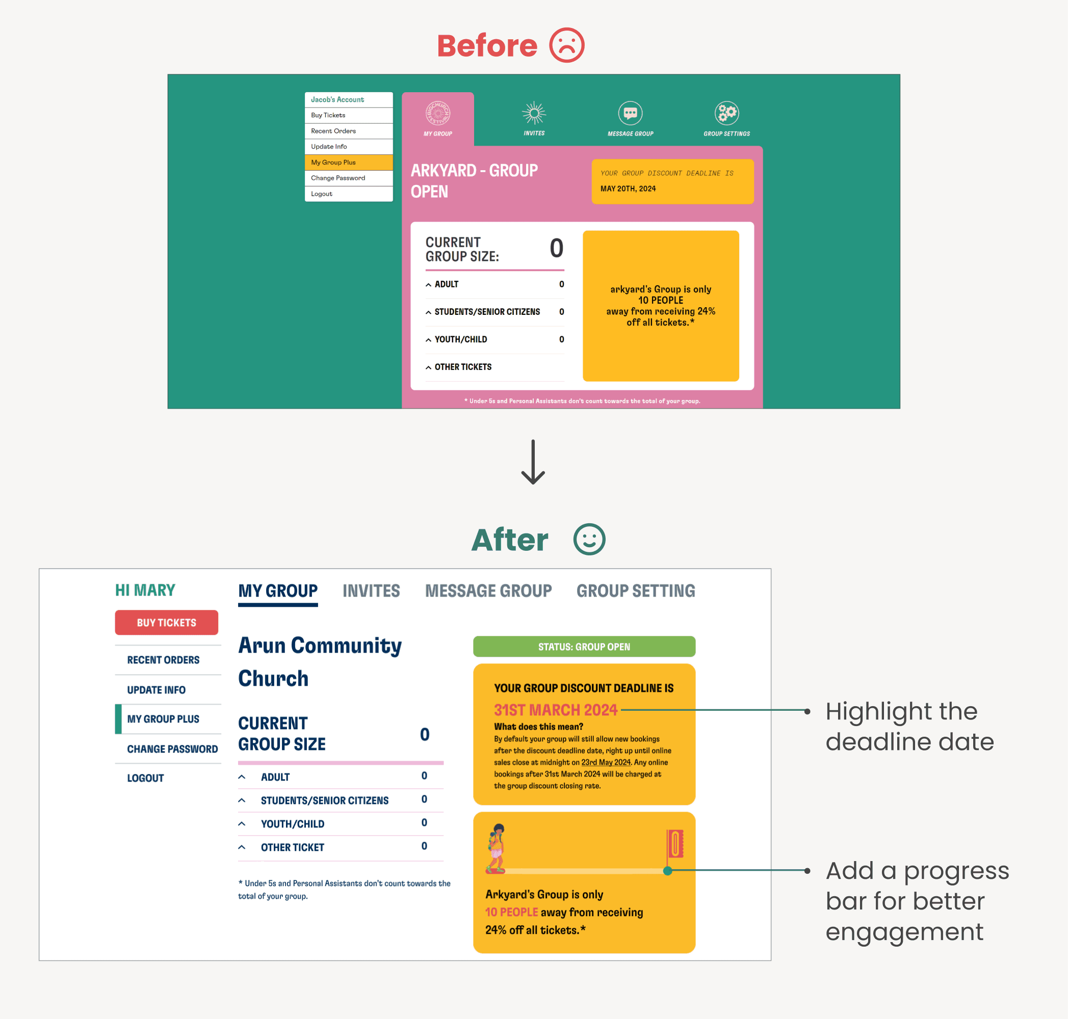

Result
Result
Result
Result
Improved usability by 10%.
Reduced CS enquiry by 10%, improving the confusion between ticket types.
Challenge & Learning
Challenge & Learning
The challenge of this project is to understand client requirements and align them with user needs. It requires balancing client suggestions with the design through effective communication and negotiation.
The challenge of this project is to understand client requirements and align them with user needs. It requires balancing client suggestions with the design through effective communication and negotiation.
Next Steps
Next Steps
The project has now been handed over to the developer after two rounds of QA. The developer has already made updates to the existing site. We have received positive feedback from the CS team, stating that they have received fewer enquiries regarding ticket types.
The project has now been handed over to the developer after two rounds of QA. The developer has already made updates to the existing site. We have received positive feedback from the CS team, stating that they have received fewer enquiries regarding ticket types.
Thank you for reading
Thank you for reading


Thank you for reading
Thank you for reading
Thank you for reading
